
The YouTube Play:
- Rank a county, not a metro.
- Title it Ranking [MARKET]’s BEST & WORST [UNIT] ([QUALIFIER]).
- Thumbnail: aerial of your market, three zones in green / yellow / red, you pointing at it.
- Open by naming the viewer’s mistake, not your credentials.
- Deliver fit, not verdicts. Never actually say “worst.”
- 10 to 14 minutes. Then do it again for the next county.
Making hyperlocal YouTube videos for your real estate business is hard enough already. So why make it harder by trying to invent some unique, special-snowflake, one-of-one idea every time you sit down to record?
Work smarter by using 1of10. It’s a tracker that watches real estate YouTube channels and flags the videos massively outperforming what that channel normally does. So instead of guessing what might work, you can go look at what is performing right now.
If the same packaging pops in Coastal Delaware, Honolulu, Bucks County, Greenville and Phoenix, odds are pretty good it’ll pop in your market too. (By “the packaging,” I’m specifically talking about the YouTube title and the thumbnail.)
So this week, I went digging to see what’s working and found the stoplight map.
It’s everywhere right now, it looks incredible, and it’s almost embarrassingly easy to replicate.
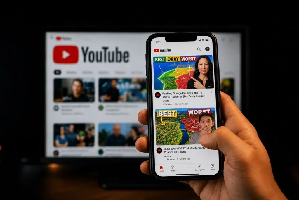
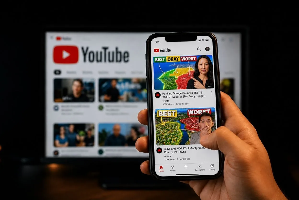
Check out these examples:
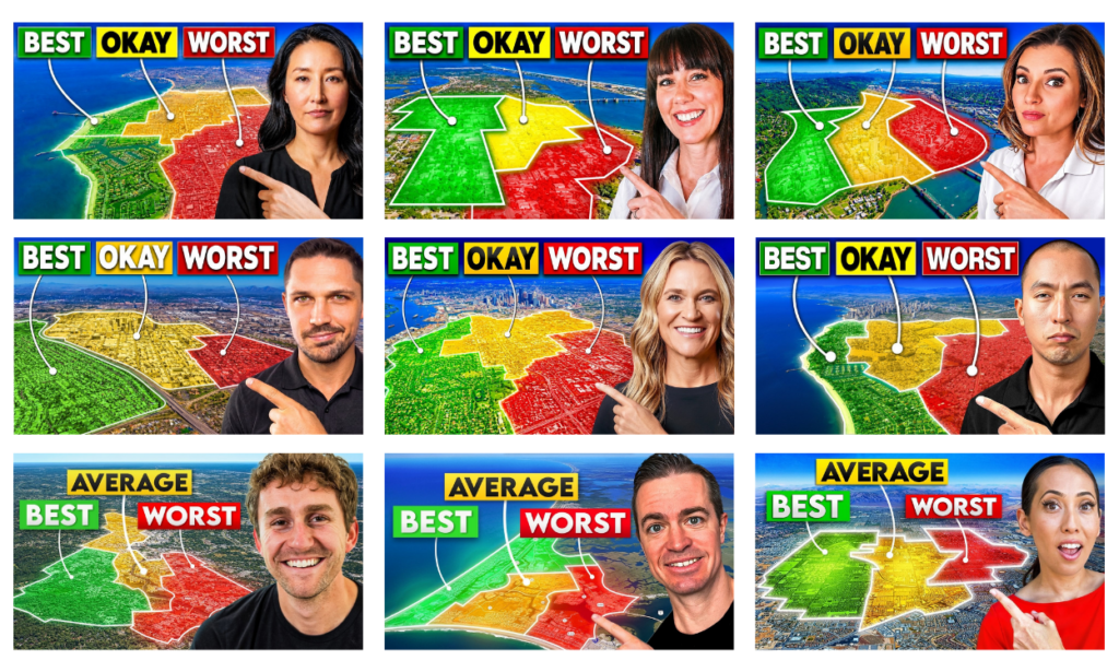
YouTube video thumbnails, sourced from 1of10.
Here’s what it is, why it works, and how to run it in your market.
Why this beats chasing views
First things first. You’re not competing with MrBeast. You’re competing with Todd, who has 12 subscribers and posts a market update once a year from his car in a quarter-zip.
Which means you’re competing with agents in your market who aren’t creating content about the specific neighborhoods, suburbs, and counties buyers are looking at.
The video below, by LivingInOrangeCountyExperts, had 9,613 views. Nearly every one of those viewers was researching a move to one specific county.
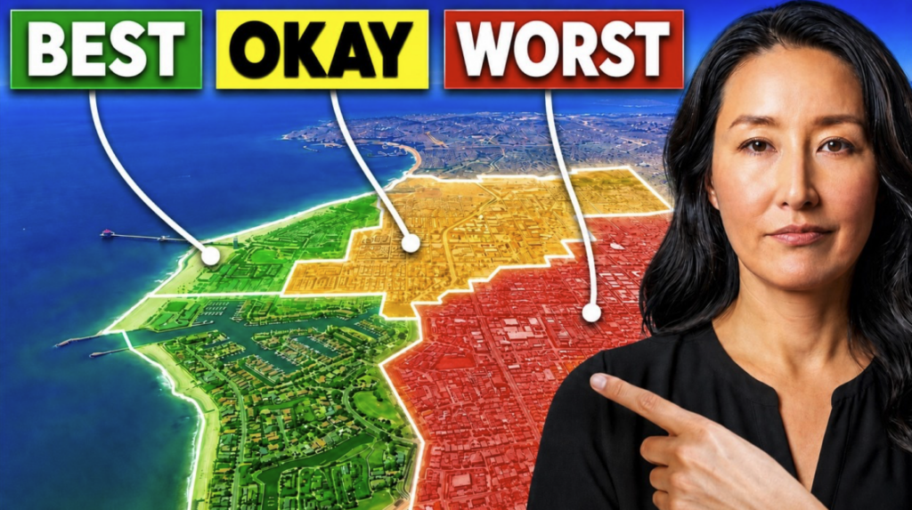
Nationally, you might be all but invisible, but in your county, you can be the only person who ever bothered to take a closer look and provide clarity on the pros and cons of each neighborhood for potential buyers, depending on their budget and priorities.
Now, let’s break down the stoplight map packaging and strategy so you can recreate it for your market.
What is the stoplight map thumbnail?
The stoplight map is a thumbnail format currently being used by real estate agents for neighborhood-ranking videos.
It has these four parts:
- an aerial of the metro
- three zones filled green, yellow and red
- three tags reading BEST / OKAY / WORST
- the agent in the right third pointing at it
Does it actually work?
Every video in this cohort beat its own channel average. Median multiple: 2.3x.
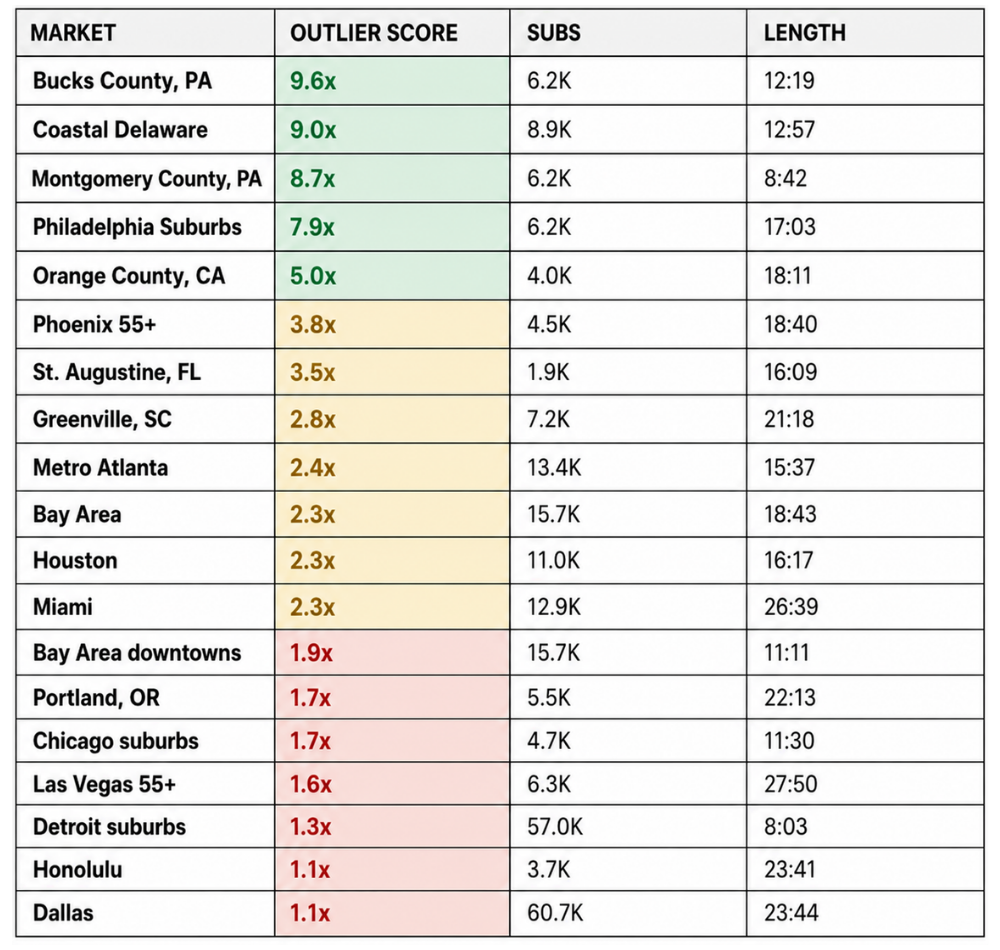
The “outlier score” column shows how hard the video beat its own channel’s recent average. Bucks County’s 9.6x is 9,613 views on a 6,200-sub channel. Dallas’s 1.1x is 3,456 views on a 60,700-sub channel.
Three things jump out of that table:
- Small channels won. The top four are all under 9K subs. The 60.7K channel finished last.
- Small geography won. Counties and sub-regions took the top four. The big metros got smoked.
- Short won. Under 13 minutes ran a median 5.3x. Over 20 minutes ran 1.65x.
Why does the title work?
This title has all the elements, including one that often gets left out:
Ranking Orange County’s BEST & WORST Suburbs (For Every Budget)
The median title in this cohort is 55 characters, exactly where YouTube cuts you off on mobile. Pull the market out and it’s a fill-in-the-blank:
Ranking [MARKET]’s BEST & WORST [UNIT] ([QUALIFIER])
Here’s the breakdown for each element:
- “Ranking” – Promises a verdict. A list of neighborhoods is a search result; a ranking needs a human with an opinion and something to lose. That’s the part Google can’t do.
- “BEST & WORST” – Covers the daydream and the fear in four words. Nobody moving at 11pm on a laptop is running just one of those.
- The “UNIT” – Smaller is better. Bucks County competes with nobody. “Dallas” competes with every relocation channel in Texas.
- The parenthetical “QUALIFIER” – The most valuable words in the title, and the one a lot of agents leave out.
Here’s the magic behind that parenthetical.
A buyer with $600K reads Ranking Orange County’s BEST & WORST Suburbs, works out that the green zone is nowhere near their number, and scrolls.
You never see it happen, of course. It’s half a second before the click would have existed.
Now add the qualifier (e.g., “For every budget”) in parentheses. Same buyer, same budget, except the title has just told them there’s a section with their number on it. The qualifier turns a judgment show into a shopping tool.
There’s a caveat here. The words, “for every budget,” will likely set up some viewers for disappointment. If the lowest price point in a particular market is $400K, anyone looking for homes priced below that will learn pretty quickly that “for every budget” doesn’t actually mean “every budget.” So, it helps to point out early what the median home price is in your area, as well as to list the specific price tiers you’re including.
The sooner viewers find out whether or not your video is for them, the better.
Why does the stoplight map thumbnail work?
The stoplight map thumbnail delivers meaning before viewers even notice the words. You knew what green, yellow and red meant before you processed a word. That’s what buys the labels enough time to get read at all.
Two more reasons, both free:
- The map is their city. No stock photo beats that’s my town, and somebody scored it. The viewer supplies the relevance on the way in.
- You can see the answer but not read it. Three tiers, roughly where they sit, and no town names. That gap has a shape, and shapes are hard to scroll past.
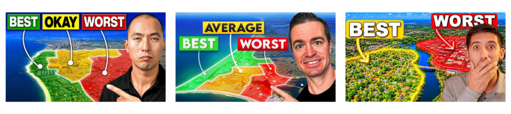
The YouTube channels for the above thumbnails, in the order displayed:
The 5 cardinal rules for these thumbnails:
- Green goes left. Fifteen of sixteen. You land on the daydream, finish on the fear. Angle or mirror the aerial so the geography cooperates. Nobody’s checking your compass.
- Never name a town. Not once, in any of the sixteen examples I reviewed. It spends the curiosity, and it puts a real place under the word WORST forever, in a market where you hold a license.
- Three elements, max. Face, map, labels. Your brokerage logo has never earned a click in the history of YouTube.
- No readable street names. The second they start reading the base map, they’re gone.
- No garbage cutout. A grainy photo of you on a sharp map discredits the whole image.
What do they say in the first sixty seconds?
Seven of the videos open with functionally the same sentence, in seven unrelated markets.
Here are four of them:
- HONOLULU “Most buyers shop backwards, and it quietly costs them the home they actually wanted.”
- PHOENIX “Most buyers, honestly, shop backwards. They fall in love with a community name first…”
- ST. AUGUSTINE “Most buyers search St. Augustine backwards. They fall in love with the community first.”
- HOUSTON “Most buyers do it completely backwards and they fall in love with Katy or The Woodlands…”
It works because it describes the viewer’s own behaviour before they’ve admitted to it. They did open Zillow and type in a neighborhood somebody mentioned at a barbecue.
It’s also a warning rather than advice, and it contains zero geography, which is exactly why it spread to seven markets.
The six beats of the scripting framework:
- The mistake. “Most buyers shop backwards.”
- The failure movie. They fall for a name, see what the budget buys, and “the dream cracks.” That last bit is an actual quote.
- The reframe. “Start with your budget, then find where it goes furthest.”
- Proof. One sentence, one number. “I’ve sold 88 homes across Honolulu, more than $55 million.”
- The plan. Three named things, not a vague promise.
- The de-shame, then go. “This isn’t about judging your budget. Every tier can win.” → “Let’s go.”
Beat six is the cheapest retention you will ever buy. You just announced a ranking. In fifteen minutes this person works out that the tier they can afford is not the green one. One sentence stops them from leaving.
The hedge test
Hesitant language sneaks in when you’re not 100% sure what you’re saying is true.
Here’s one example from a Dallas video:
“That’s really kind of completely backwards, and today I want to kind of flip the whole thing around.”
It’s either completely backwards, or it’s not. There’s no “kind of completely.”
Compare that with this language on Honolulu markets:
“Most buyers shop backwards, and it costs them the home they actually want.”
Every “kind of” is a little door you install in your own intro, and people will walk through it. Without looking back. You think you sound humble or relatable. What really comes across is you’re not sure this is worth fifteen minutes. And they believe you.
Bottom line: if your intro needs hedging to feel true, you need a better claim.
Do these videos ever say which suburbs are the worst?
Almost never. Twelve of the videos never say the word once in the body. Cohort average is 0.6 mentions per video, and most of those are just the intro repeating the title.
What they say instead: underrated, hidden gem, under the radar, overlooked, trade-offs. All more positive language.
Or they go neutral. Portland Life says “trade-offs” thirteen times in one video.
The idea that there’s a best, worst and middle-grade ranking gets people curious. But no one wants to be told the area with homes that fit their budget is the “worst.” They will not thank you for that.
The trick here is to get them curious enough to click and deliver something that makes them want to see more.
The judgment frame in the thumbnail sells the click. The fit frame locks in their attention. Bonus: it also gets them curious about your other content.
What separated the biggest wins?
The biggest winners among content creators building on this trend are those who included specific local details no one else could have written. What it says is “I live here, and I know things about this area you won’t learn from your AI research.”
The shared script produced the middle of the board, not the top of it. The “shop backwards” cluster medians 2.3x against 2.35x for everyone else, which is statistically a coin flip.
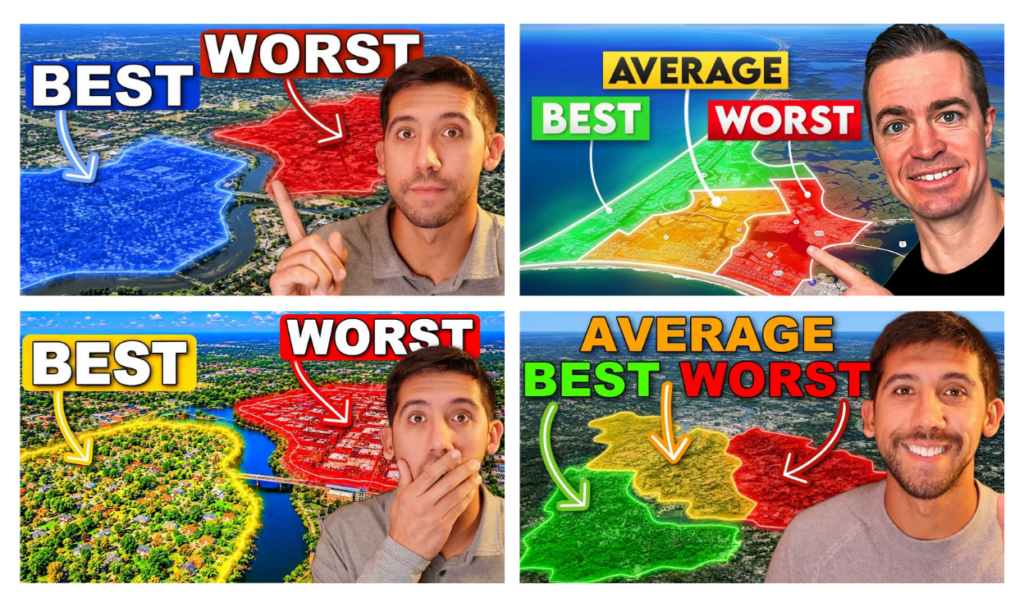
Above are the four highest multiples. Three belong to one channel, and they’re not three attempts at the same video. They’re Bucks County, Montgomery County, then the metro-wide ranking over the top.
That channel doesn’t use the template hook at all. It opens with credibility, an observed pattern, then the hidden problem: you’re only seeing five towns and there are thirty.
Each video follows a simple formula, providing real sale prices and other details, town by town, in 8-13 minutes.
You see this across multiple YouTube channels because it works, when there’s real local knowledge behind it. That’s the thing: anyone can copy your thumbnail. Nobody can copy thirty years of knowing which left turn ruins your commute.
Steal This Play for Your YouTube Channel:
- Pick a unit smaller than feels comfortable. County, corridor, school-district footprint, 55+ segment.
- Write three titles. Vary the unit and the parenthetical.
- Shoot the cutout once. Eight poses, both directions, covers a year.
- Build the map. Angled aerial, three zones, green left, no town names.
- Write the intro in six beats. Sub your own sentence for beat #1. Seven people already use the “buyers shop backwards” line.
- Structure the body by tier, not by town. They’ll wait for their price bracket.
- Cut to 10 to 14 minutes. Start with the drone footage.
- Deliver fit, not verdicts. People want to know if your video has something for them.
- Two native CTAs. One at three minutes, one at the close.
- Do it again for the next county. You’ve already got the formula in place, so the second one is half the work.
4 Bonus FAQs
Does the spotlight map format still work in 2026?
Yes, but it’s mid-cycle. All nineteen videos analysed beat their own channel average, median 2.3x. The format went mainstream between April and August 2026, and packaging formats typically expire four to six months after that point.
Should I rank a city, a county, or a neighborhood?
Go smaller. The four biggest multiples were all county-level or sub-region (Bucks County, Coastal Delaware, Montgomery County), while metro-level videos in Dallas and Honolulu finished at 1.1x. Smaller unit means warmer audience and almost no competition.
Is ranking neighborhoods a Fair Housing risk for a licensed agent?
It can be. Share facts you can source and defend: price, inventory, days on market, commute, taxes, HOA and CDD fees, insurance, walkability. Avoid stacking school ratings on top of a neighborhood ranking, or actually saying one area is the “worst.”
Can a small real estate YouTube channel compete with big ones?
In a local market, yes. The top four multiples here all came from channels under 9,000 subscribers, while a 60,700-subscriber Dallas channel finished last. Hyperlocal content is scored against local intent, not national reach.